Heavyorder
branding case
Heavyorder is built for an industry where too much choice often creates too little clarity.

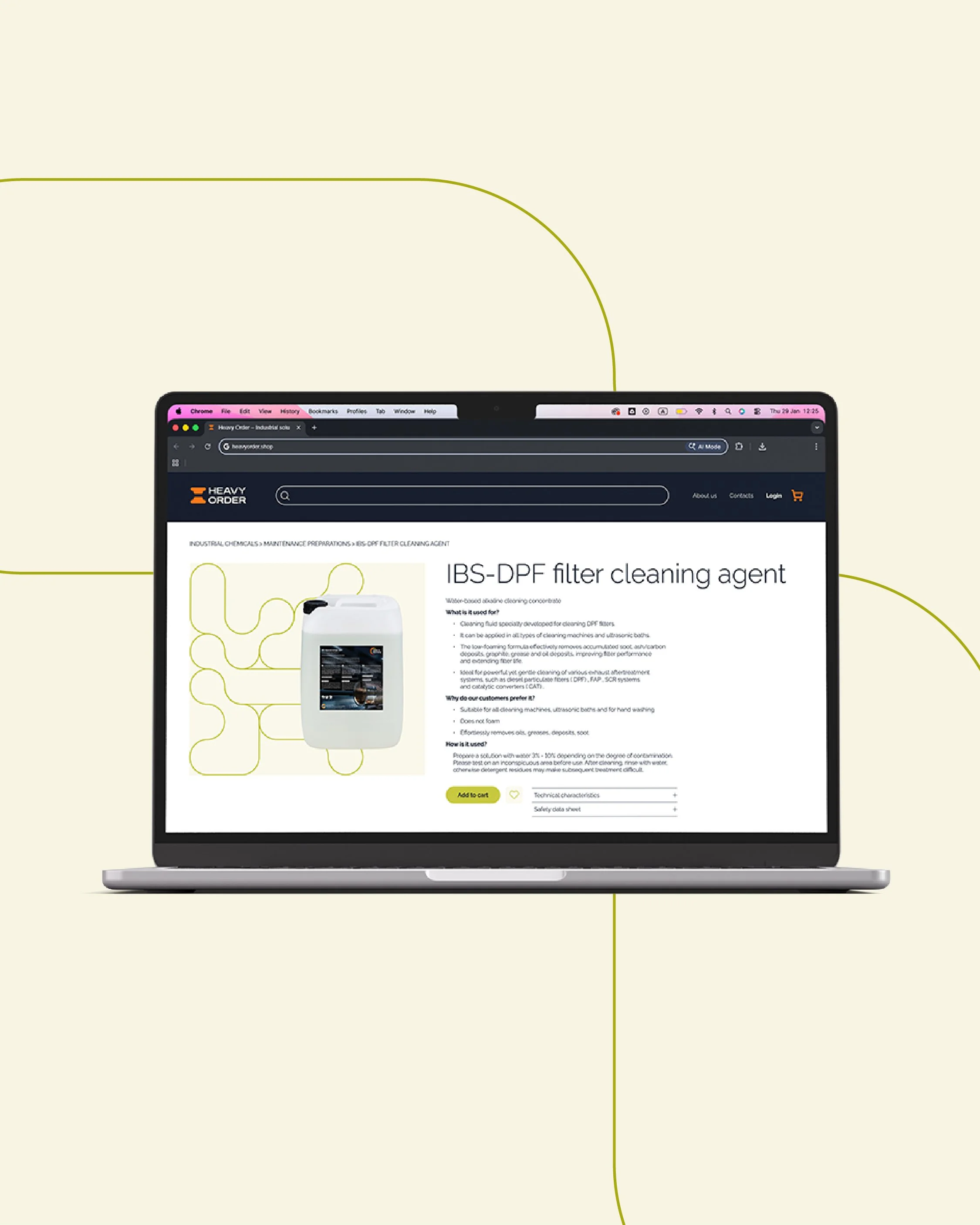
The project
Heavyorder
Naming & Brand Identity
The Challenge
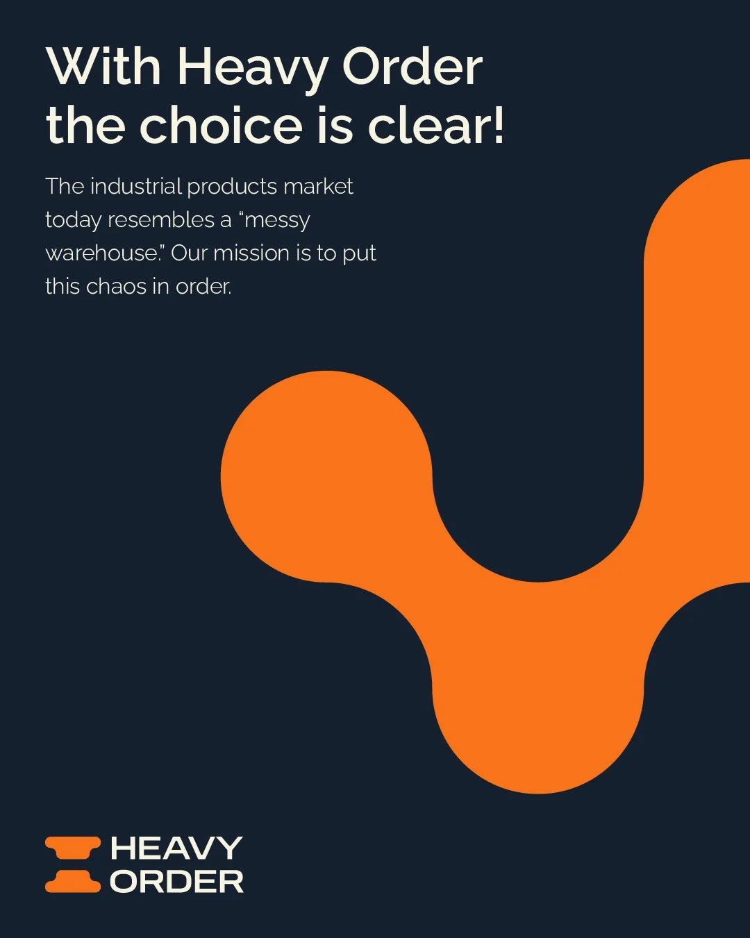
The industrial products market is crowded with endless catalogues, overlapping specifications and too many choices that often create more confusion than clarity.
Heavyorder was created to challenge that model.
The idea was simple: fewer products, better choices.
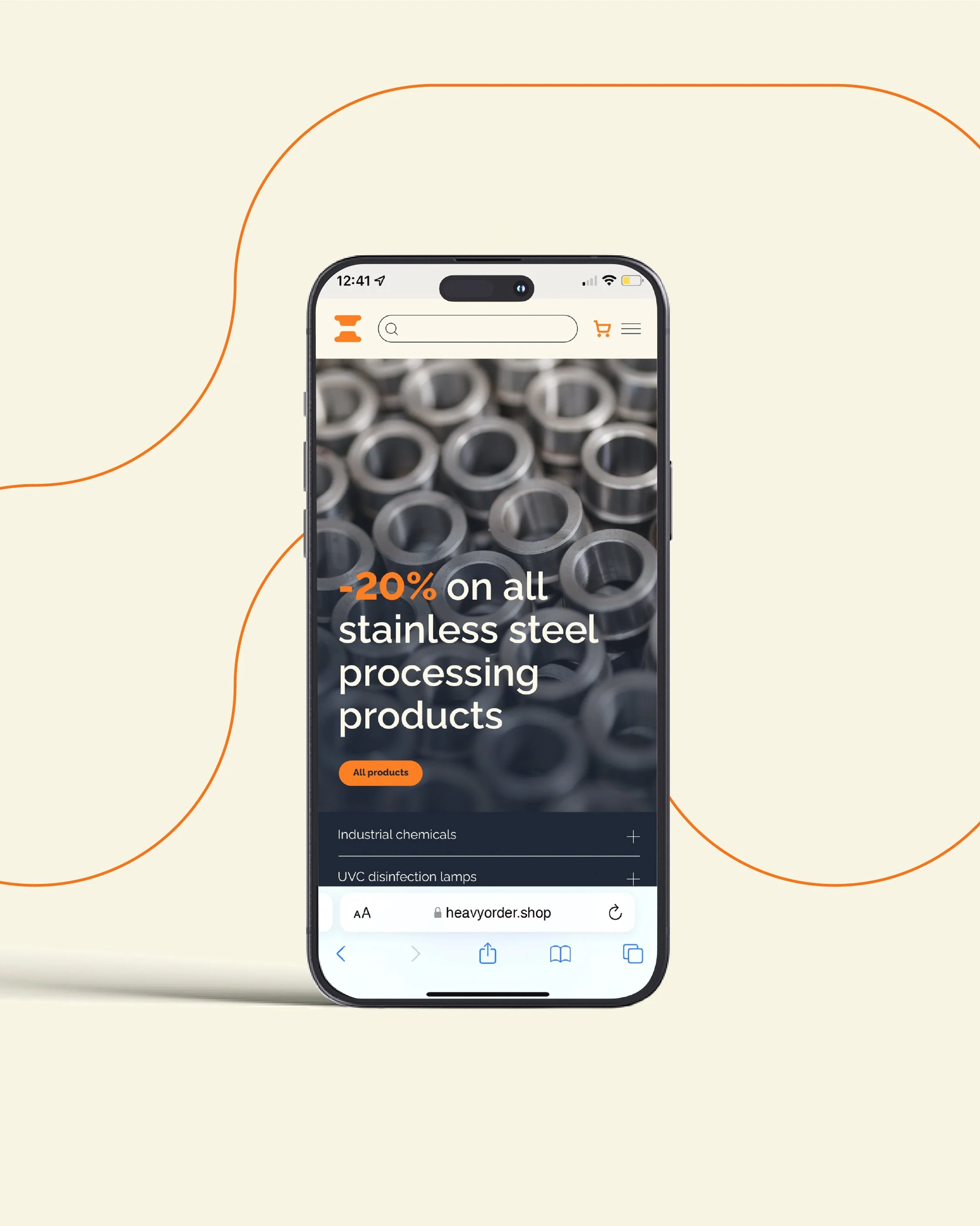
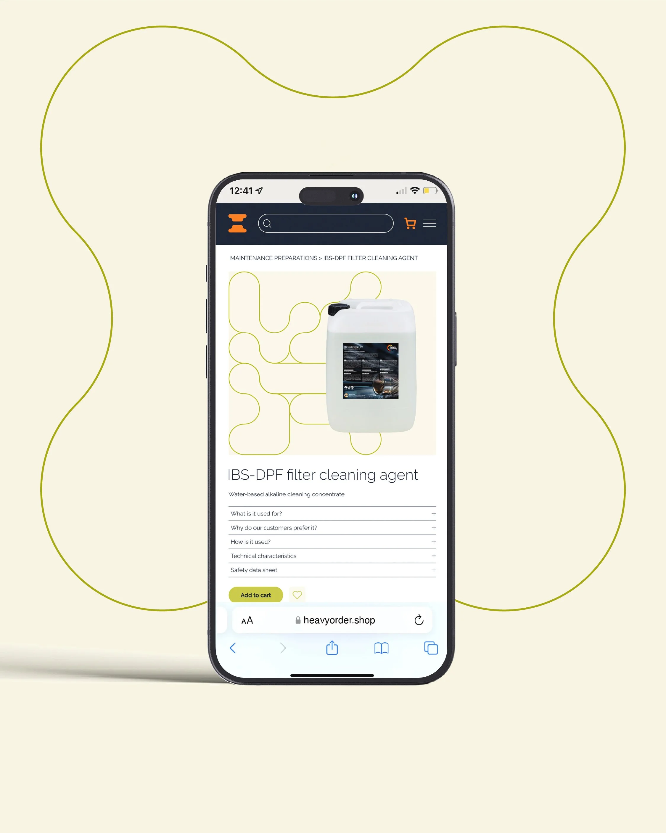
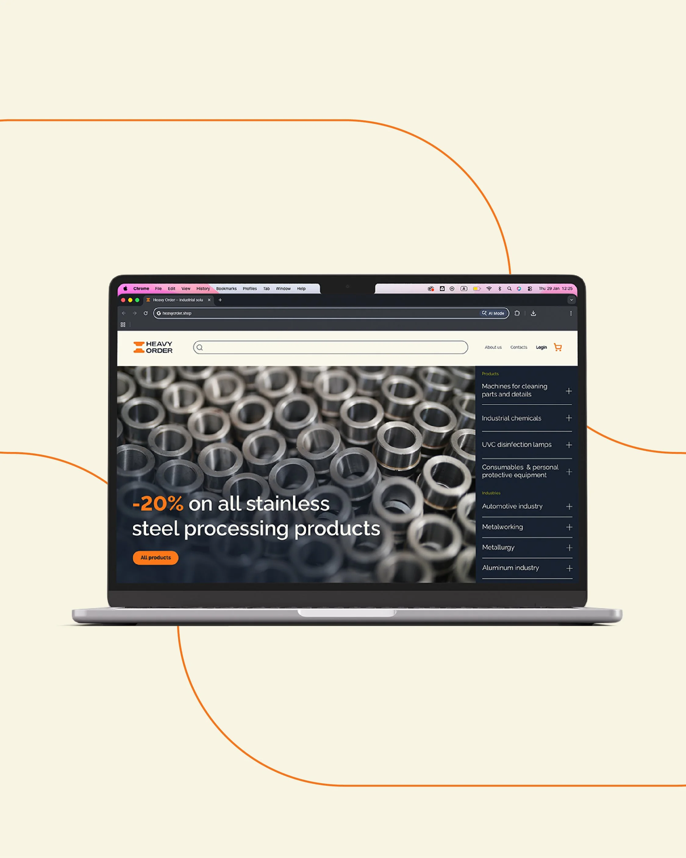
A curated online destination where professionals do not have to search through hundreds of options to find what works. Instead, they find products selected for reliability, performance and real-world use.
The Strategic Foundation
The brand was built around three core principles:
Efficiency. Trust. Reliability.
These values shaped everything from the name to the visual identity and the overall brand experience.
The Name
Heavyorder combines two defining ideas.
“Heavy” represents the scale, strength and authority of industrial business.
“Order” introduces what the category often lacks: structure, simplicity and clarity.
Together, the name captures the brand’s ambition to bring order to a complex market and make professional purchasing more efficient.
The Brand Identity
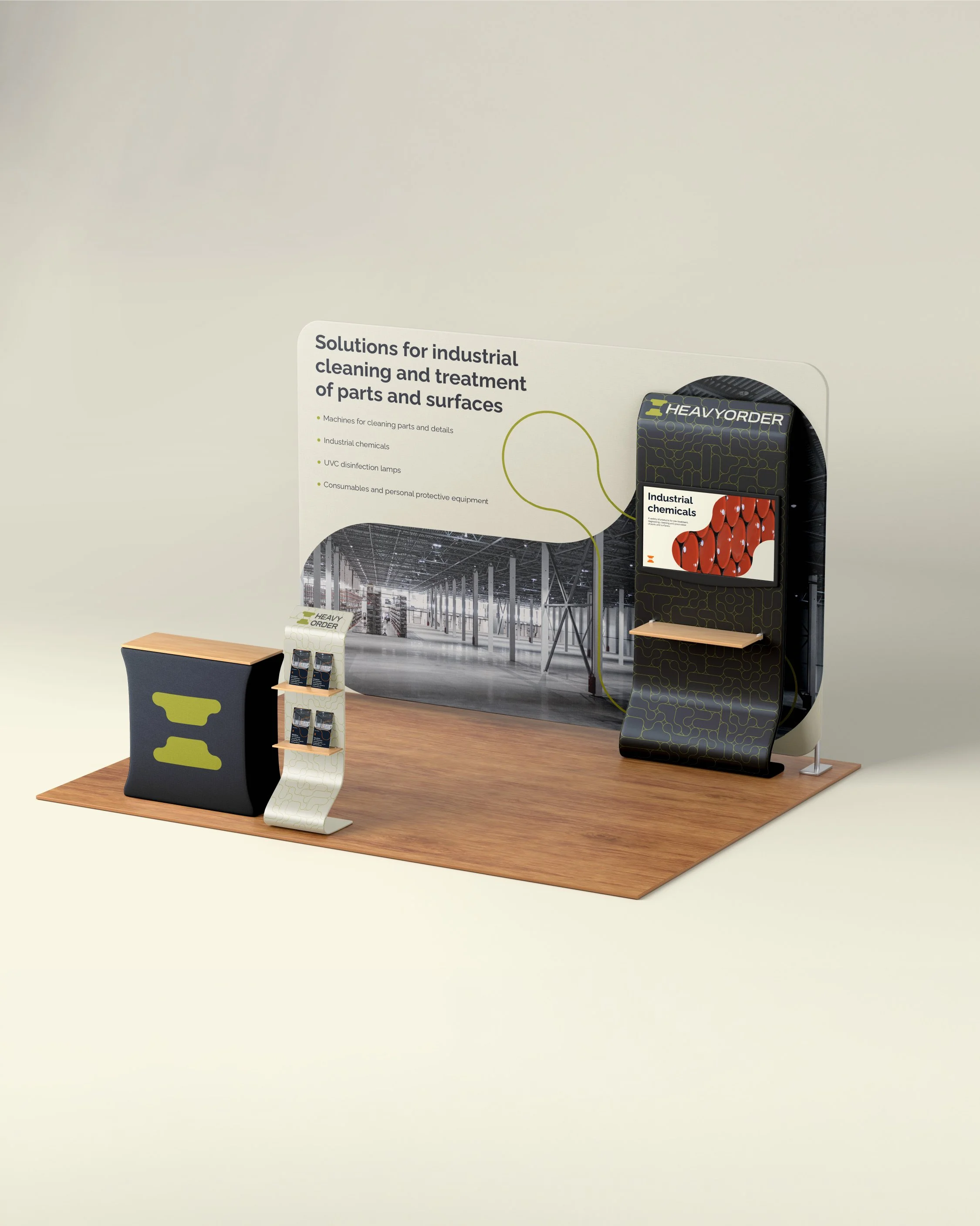
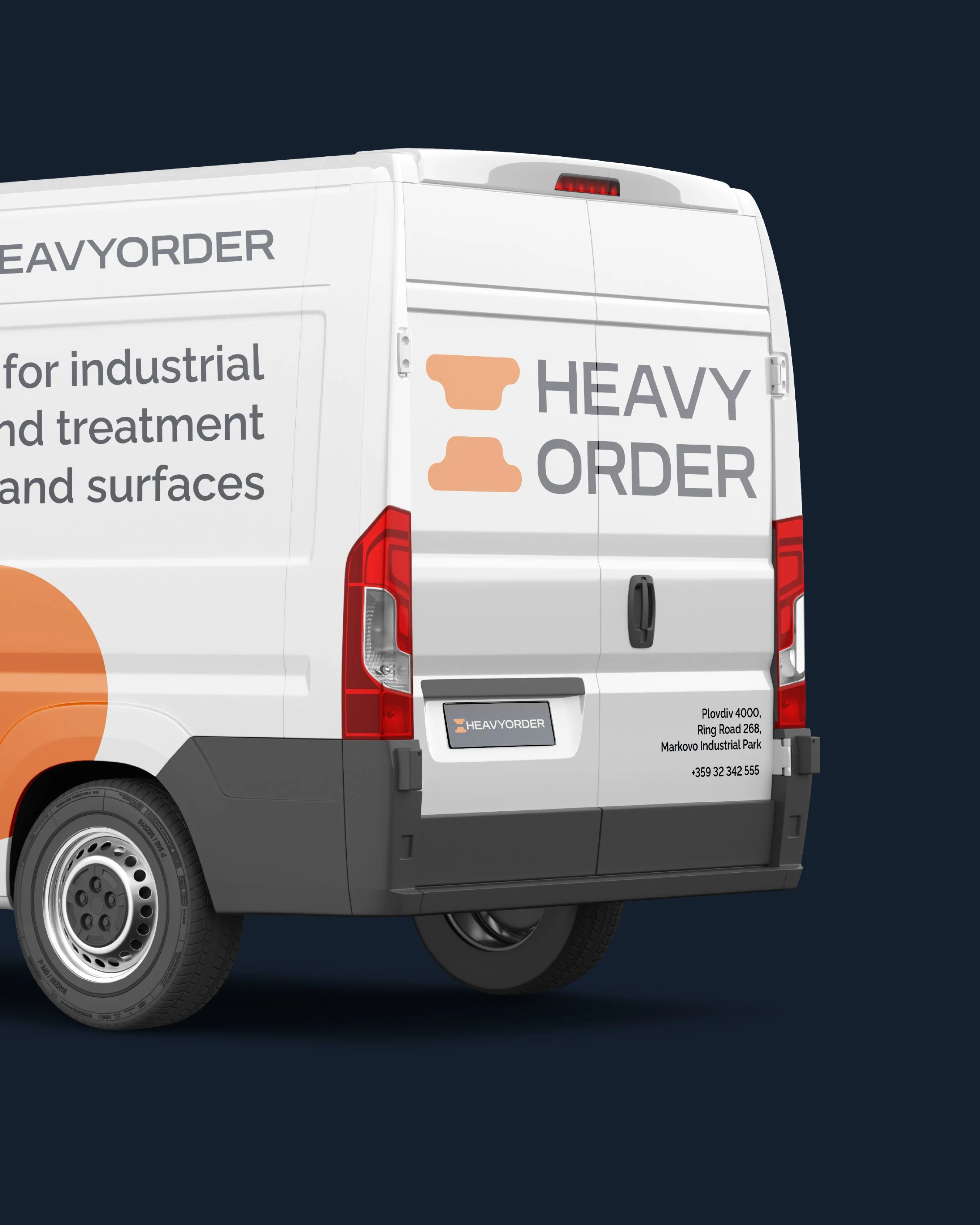
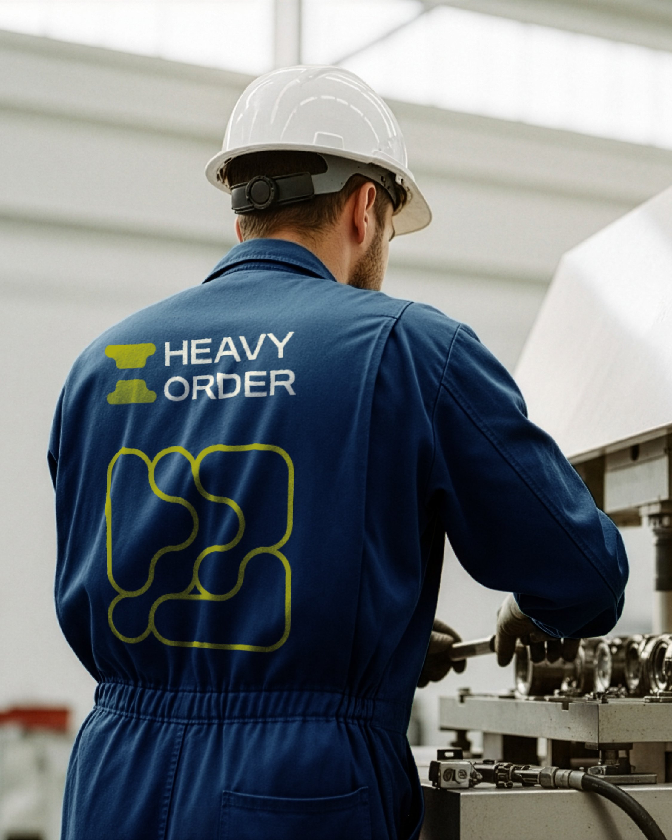
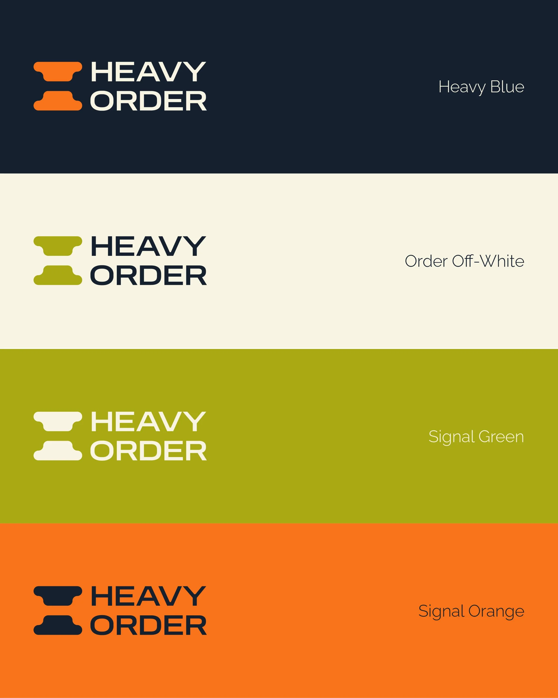
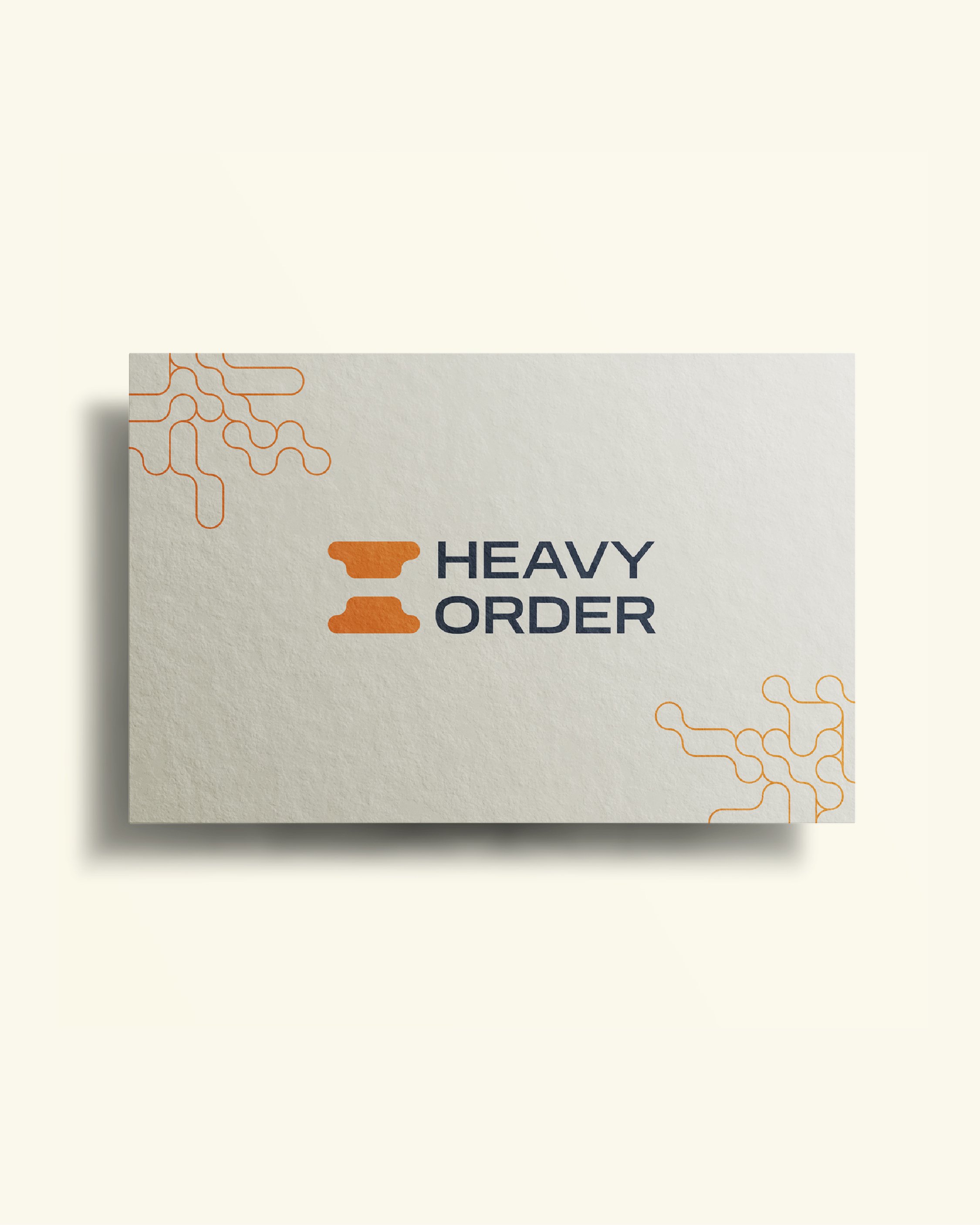
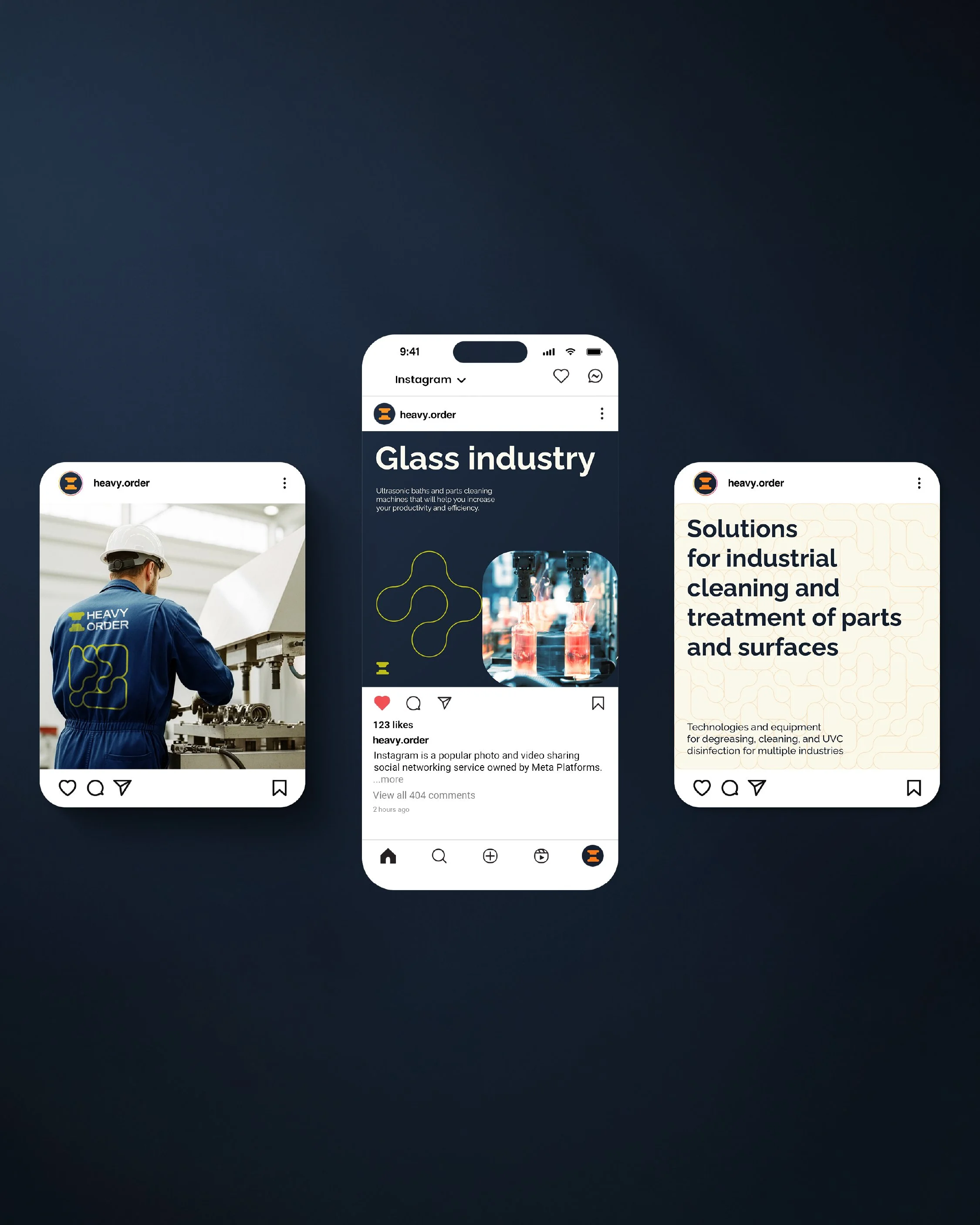
The visual identity follows the same strategic logic: bold, balanced and precise.
It combines the confidence of a category leader, the discipline and synchronization of a high-performance team, the reliability of German engineering and the clarity of a brand that has nothing to hide.
The visual language is strong without being overloaded, reflecting Heavyorder’s belief that simplicity can be a competitive advantage.
A swallow became a central symbol within the brand world, representing teamwork, hard work and a new beginning.
The Idea
Heavyorder does not aim to offer everything.
It aims to offer the right thing.
Because in a market crowded with endless catalogues, quality should not take hours to find.
Naming, Brand Identity, Guidelines & Implementations by Instinkt.